
Gregg M Elliott
617-872-5151 || greggmelliott@gmail.com

Headlines that hook you,
flows that guide you through, and
systems that hold it together with one voice across all screens
I work on the things you can't afford to get wrong: money, benefits, health.
Brands I've helped succeed





MY CRAFT
First, I make you want it
Most financial products are hard to grasp. Years of writing to earn attention taught me how to fix that — clear, sharp, human words that make you want in.
LANDING PAGE:
Fidelity Health Savings Account

PRINT:
HELMSMAN MANAGEMENT

EMAIL:
MERRILL STOCK STORY

MY CRAFT
Then, I help you get it
Wanting something is easy. Using it is where most products lose people. So once you're hooked, I turn the rest into clear steps you can follow — signing up, getting the most out of it, sticking with it. That's the UX content strategist in me.
EMAIL CAMPAIGN


Case study: Health benefits, minus the dread

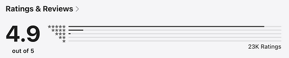

The Fidelity Health app
Most people would rather ignore their health benefits. The language is dense, the stakes are personal, and the stress is high.
The Fidelity Health app flips that. It turns a chore people dread into something they can handle in a minute, right from their phone.
What I accomplished
I've been the lead content strategist on the app since its first releases, working across several Agile squads.
• Built the content system — the voice, the patterns, and the guardrails that keep every screen sounding like one product.
• Wrote every word, and partnered with design and engineering to build and test the flows, from the first release to what's shipping now.
• Steered all of it through legal, risk, and compliance.
What we delivered
Flows across iOS and Android that cover the whole benefits journey.
• Manage benefits, HSA, and FSA in one place.
• See plan details, and save or share benefit, prescription, and vaccination ID cards.
• Check balances, reimburse out-of-pocket costs, and pay providers directly.
• Make tax-deductible HSA contributions, upload receipts, and track payments.
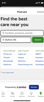
• Find in-network providers and scan products to check what's eligible.
The Fidelity Assistant
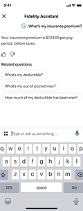
The app includes an AI assistant for benefits, HSA, and reimbursement tasks. It doesn't generate answers — it matches a question to a pre-written, compliance-cleared response.
In a regulated space, every answer has to be human-written and approved before it ships. And that constraint is exactly what makes the content the product.
CASE STUDY: FIDELITY HEALTH APP
An AI-powered assistant where the content is the product
The Fidelity Assistant (FA) lives inside the Fidelity Health app. But it can't generate its own answers. Fidelity is a fiduciary, so every answer has to be reviewed and cleared by legal, risk, and compliance (LRC).
When approved content is the only thing the assistant can deliver, the content isn't a layer on the AI. It's the whole thing. So I built the framework for how it speaks — the structure, the voice and tone, a style guide drawn from Fidelity's brand, and the patterns that keep every answer sounding like the same assistant. The hard part: writing answers that clear compliance and still sound like a person, not a disclaimer.




CASE STUDY: FIDELITY HEALTH APP
Systems, instead of just screens
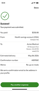
The easy way to write an app is one screen at a time. Each one looks fine on its own. But line up dozens of screens and the cracks appear: the same idea phrased three different ways, a label that means one thing here and something else there. Little by little, the app starts to fall apart.
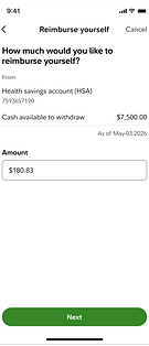
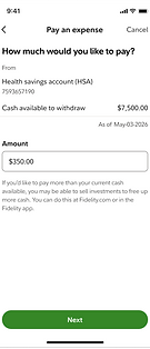
So instead of writing screens, I built patterns. The Pay an expense and Reimburse yourself flows mirror each other on purpose — learn one, you know the other. And because the patterns are written down, a designer, a PM, or the next writer can add a new flow without breaking the voice. That's how the app grows without coming apart at the seams.





CASE STUDY: FIDELITY HEALTH APP
Flows that make the complex easy
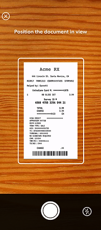
The fastest way to lose a user is to ask for too much at once. Testing with our UX researchers proved it: several small steps beat one big one. Break down an action, give each screen a single job, and a daunting task becomes doable.
So I cut anything that isn't necessary. Every word earns its place. What's left is clear, fast to read, and still sounds like a person — questions and prompts that inform and encourage, not just instruct.
Then there's timing. The right detail shows up exactly when you need it — not a screen too early, not buried in an attachment you'll never open. That's the difference between confidence and second-guessing.




CASE STUDY: FIDELITY HEALTH APP
Guidance that benefits users and employers
When something big happens — a new baby, say — the app walks you through what to get ready for, and shows how your benefits apply.
That helps the person right when they need it — and it's good business. Most employers pay for benefits their people never touch, because nobody knows they exist. Tie the guidance to a real moment and those benefits finally get used. A new parent won't dig through a benefits brochure. But "here's what to do next"? That, they'll read.
The tricky part was keeping it honest. The second it feels like a nudge toward something you don't need, people check out. So the flow leads with your moment, not the company's goal — and the benefit becomes the answer to a question you were already asking.


Case study: Activate the account you didn't know you had
EMAIL: SENT TO ELIGIBLE EMPLOYEES

Guided health savings account (HSA) activation
Some employers on Fidelity NetBenefits open a Health Savings Account for you automatically, the moment you pick a high-deductible health plan. Helpful, in theory. Except the account can't do anything until you activate it. So people end up with an HSA they didn't ask for, don't fully understand, and never turn on — and the tax-free money just sits there.
My job was the content for the flow that fixes that: a guided path from "wait, I have an HSA?" to activated and ready to use, in about a minute.
LANDING PAGE: STEP 1 OF ACTIVATION

LANDING PAGE: STEP 2 OF ACTIVATION

What I accomplished
I owned the UX content across the activation flow, working with UX design, the product squad, UX research, and Legal, Risk, and Compliance.
-
Wrote the full flow — the step tracker, the guidance at each step, the confirmations, the small moments that make an auto-opened account feel legitimate.
-
Turned a legally loaded process into plain steps a first-timer can finish without calling support.
-
Folded a company-wide priority — naming beneficiaries — into the flow without sinking its real job.
LANDING PAGE: FINAL STEP OF ACTIVATION

What we delivered
A guided flow that:
-
Turned auto-opened, dormant HSAs into active accounts people actually use.
-
Carried a company-wide beneficiary push without hurting activation.
-
Cleared every line through Legal, Risk, and Compliance and still sounded like a person.

CASE STUDY: GUIDED HSA OPENING
When you can't even say "opened"
Here's a sentence that took real work: "We started opening a Fidelity HSA for you." Not "we opened." Compliance won't allow "opened" until the account is fully activated — until then, in Legal's eyes, it isn't one. So the line has to be precise to the word, honest about a half-finished state, and still reassuring to someone who didn't know any of this was happening. Every screen went through LRC. The trick was keeping it human on the way out: accurate enough for a fiduciary, plain enough for a person.

CASE STUDY: GUIDED HSA OPENING
A second ask, without losing the first
Halfway through, the flow asks you to name a beneficiary. That wasn't the flow's idea. It's a company-wide push, because too many Fidelity participants never name one, and an unclaimed account is a real problem down the road. But activation was the priority, and nothing kills a completion rate like a forced detour into a word people don't know.
So I kept the ask light. "What's a beneficiary?" for whoever needs it — one tap, no lecture. And "No, add later," so nobody's trapped. You can serve the company's goal and still let the user finish their own. The step earns its place instead of hijacking the flow.
Case study: Sell me, don't tell me

The Fidelity Health Though Leadership website
Fidelity Health Thought Leadership produces serious benefits research — surveys, real data, sharp analysis of where health and benefits are heading. But the site described the research instead of telling a busy benefits leader why it mattered. Strong work was getting overlooked. I had two jobs:
-
Turn expert research into something busy people wanted to read
-
Make a plan sponsor or HR leader feel, in the first few seconds, that it was written for them

CASE STUDY: FIDELITY HEALTH THOUGHT LEADERSHIP
What I accomplished
I led content strategy for the site, building the experience around the research with the Thought Leadership team and my UX design partner.
• Set the site's voice, tone, and standards, drawn from Fidelity's brand.
• Wrote every word, from the homepage down.
• Built the content into Fidelity's design system — templates and components that keep it on-brand as the site grows.
• Advised the business on presenting dense research to benefits leaders, and made the case line by line.

CASE STUDY: FIDELITY HEALTH THOUGHT LEADERSHIP
What we delivered
A research hub built for benefits leaders, plan sponsors, and advisors.
• Find the insight without digging — the takeaway up top, the depth a click away.
• Read research framed around their goals — attracting talent, helping a workforce thrive — not Fidelity's.
• Move through a big, growing library that stays consistent and on-brand across every report.